Mealtime & Colour of Connection
- Oct 17, 2025
- 2 min read
Why Your Dining Room Paint Colour Matters More Than You Think.
You’ve set the table, lit the candles, and poured the wine, but if your dining room feels a little… off, it might not be the food, it might be the colour.
Yes, really, the paint on your walls can impact more than just the aesthetic. It can subtly (and powerfully) influence how people feel, how well they digest, and how long they want to stick around after the last bite.
Colour + Digestion = A Real Thing
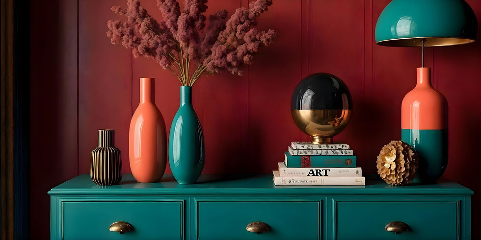
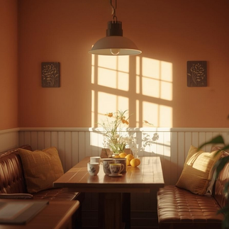
Believe it or not, certain colours can either support or disrupt your digestive process. Fast food chains have understood the power of colour for a long time…think of any major fast-food chain and it’ll bring to mind bold, bright red and yellow. These bold colours, along with bright lights, create a subconscious sense of urgency. In fast-food stores, we’re not meant to linger over one cup of coffee, they want us to buy and go. That’s not the vibe we want for our home mealtimes, right? Warm, earthy tones like terracotta, soft peach, and muted ochre are known to stimulate appetite and aid digestion, yet due to their muted tones, are also relaxing and inviting, which is why you’ll often see them in higher-end restaurants.
Cool greys or stark whites, on the other hand? They may look modern, but they can feel cold and even suppress appetite. (Not ideal when you want to savour a slow, nourishing meal.) If you really do love that Scandi white vibe, try opting for a warm white or pale cream on the walls, then accent with some soft, earth tones to bring warmth and interest to your space.


Colour Sets the Social Tone
A 2018 study in Color Research & Application found that warm, saturated colours increased feelings of comfort and social openness. Translation? The right dining room colour can encourage deeper conversation, more laughter, and a genuine sense of togetherness.
Think:
Olive green for grounding
Burnt orange for warmth and energy
Wine red or plum for intimacy and richness
These shades send a visual message: “You’re safe here. Stay a while.”


Relaxation Starts with the Right Palette
If your dining space doubles as a place to unwind after a long day, colour can help signal that shift. Dusky pinks, warm clay, or soft sage gently slow the pace and invite you, and your guests, into rest-and-digest mode.
After all, the dining room isn’t just about eating. It’s about connection. And colour is the invisible thread that ties it all together.
Final Bite
Next time you’re thinking about paint, don’t just ask “What looks good?” Ask: “How do I want people to feel here?”
Because in the right colour environment, meals taste better, conversations run deeper, and everyone feels a little more at home.
Book your colour consult here on 0418 393 773 or contact me at KH_InteriorDesign@outlook.com